Threema
Bringing design to an engineering-led messenger

Context
Client: Threema
Role: UX/UI Designer — concept development, prototyping, user research & testing
Duration: September 2024 – Present
Team: 1 Head of Product, 1 Product Manager, 13 Engineers, 1 Designer (me)
Brief
When I joined Threema, there was no design team. No design system. Just a privacy messenger that millions of people trusted with their most sensitive conversations and found genuinely frustrating to use.
The product had been built and run entirely by engineers, which meant it worked. It just didn't feel good. The scope was broad:
Modernise the look and feel without breaking the trust that comes with being "the privacy messenger"
Introduce a design culture into a team that had always shipped without one
Ship features that actually mattered for B2B and B2C customers, across Desktop, iOS, Android, and Web
Solution
Over two years, we shipped a long list of small improvements. None of them were huge on their own — but together, they added up. Here’s a few things that we’ve built.
Emoji reactions
My first project at Threema, and immediately a stakeholder problem before it was a design one. Threema’s reactions were a green thumbs-up and an orange thumbs-down deliberately different from other messengers, and some users working at Threema loved that. The push to modernise had to go through that attachment. Rather than making reactions look exactly like WhatsApp or Signal, I introduced a differentiator: the ability to add more than one reaction to the same message. It gave Threema a reason to evolve without feeling like it was just catching up.
Availability status
This one started as a simple “out of office” setting and grew into something more considered: a status system that lets you set yourself as busy or unavailable, with a custom message visible to anyone who opens your chat. The intended use cases were obvious: meetings, holidays. What was harder to predict was watching colleagues turn it into something playful, using it for casual, expressive statuses that had nothing to do with availability. That kind of unplanned adoption tends to be a good sign.
Media sending
Attaching media used to pull you out of the conversation entirely. I brought it into the message text field instead, so you can write and attach at the same time, with the chat staying visible throughout. A small structural change that makes sharing feel like part of the conversation, not a detour from it.
Results
Threema doesn't track usage analytics, by design. Measuring impact here means looking elsewhere.
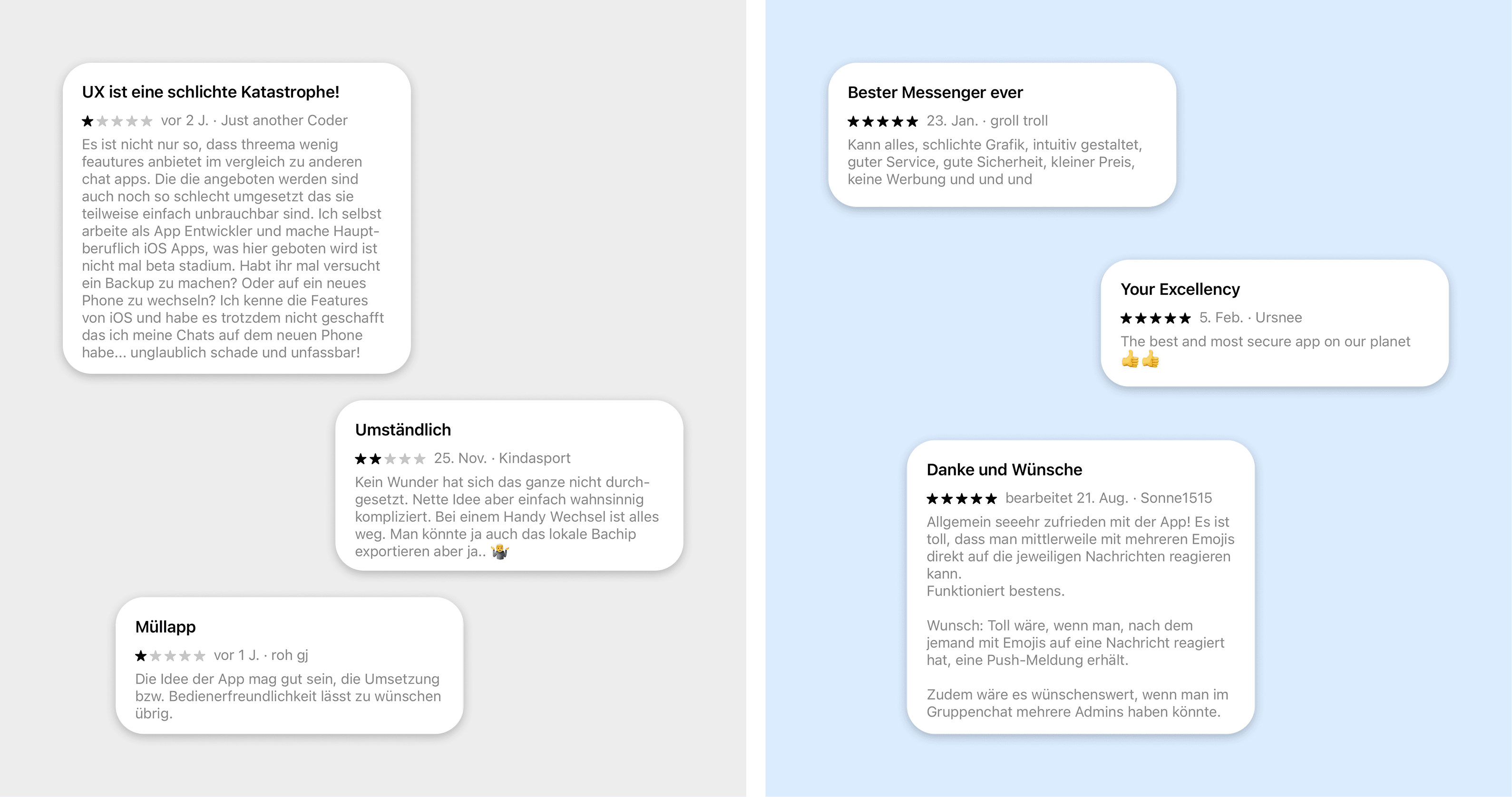
The reviews changed. Before I joined, users consistently flagged the same things: missing features, an interface that wasn't intuitive, a painful device transfer experience. Since then, the tone has shifted. Users write about things that are specifically ours: multi emoji reactions, a cleaner interface, an overall experience that feels like it was actually designed.
The team changed too. Design is now part of how features get shaped, earlier in the process, with tighter alignment between product, design, and engineering. That means fewer cycles spent on the wrong things, and more energy going toward what users actually need.
Process
Earning trust before pushing for change
Before I could improve the product, I needed to understand the people building it. I started by meeting one on one with every engineer, mostly just to listen: how they'd been working, what they were worried about, what they hoped having a designer on the team might actually mean. From there, I made the case for why design matters not as an aesthetic layer added at the end, but as a way to make sure the right things get built in the first place.
Building the infrastructure from scratch

There was no design tooling in place when I arrived. I set up Figma for the organisation, went through the existing product and documented it into components, and started building out a design system bit by bit, so it was usable even while it was still being built.
Designing and shipping, repeatably
The process scaled depending on the project. Larger features went through a full discovery phase: defining the problem, aligning across product, engineering, and backend, surfacing open questions early, running competitor analysis and user interviews, and synthesizing what we'd learned. Only then did we move into low fidelity concepts, high fidelity design, prototyping, and a formal handoff in Figma. Smaller improvements followed a lighter version of the same thinking, still deliberate, just quicker. Across all of it there was joint QA between design and engineering, plus an ongoing loop of iteration after launch.